Zac Johnson Slam Dunks Facebook Ads

Facebook Ads is an amazing tool, even just to play around with. I often find myself creating fan pages and setting up new ad campaigns, just to see the different images that can quickly swing a campaign from boring to interesting.

When using the same text ad copy and only changing the image, you can learn a lot from your advertising.

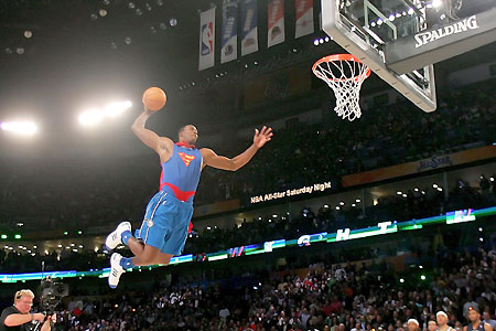
After Blake Griffin posterized Kendrick Perkins with that ridiculous dunk a few weeks ago, I thought it would be interesting to create a fan page around it and test a few different Blake Griffin images and see how they perform. The fan page would just be a place of conversation for fans, and no monetization was put in place. In this test I grabbed a few different images, ranging from just Blake Griffin, to different pictures of him dunking, and some of them were pictures from the actual dunk on Perkins.

Each of the campaigns received around 30,000 impressions and were targeted to users 18 or older, in the US and interested in “Blake Griffin”.

Top Performing Image

Of the images I setup, this one was the clear winner. I wasn’t that surprised, as it featured the actual dunk against Kendrick Perkins, while also throwing a big image of Blake Griffin looking down on Perkins. Overall it’s just a high quality image with Facebook Ads.

Average Performing Image

There was a wide range of “average” click through rate image. This one had a .154% ctr, and again was featuring a capture of the famous dunk on Perkins. It’s all about the action shot and how the user perceives the image, and grabs their attention.

Worst Performing Image

When looking through the images used in this test ad campaign, I had much higher expectations for this image. It was made famous as one of the dunks from Griffin during the all star break. It was actually one of the lowest performing images in the collection. My first impression when I saw the image, was that it would perform much better because it was kind of weird looking, and was actually perfectly scaled for 110×80 sizing of Facebook Ads images.

The Take Away…

So what can you learn from this quick Facebook Ads test? For the most part, the importance of adding a wide selection of images when creating an ad campaign. If you only pick the images that you think will do well, you are already setting yourself up for failure.

As mentioned, this was just a fun case study I put together, but there is actually so much more than could be setup for this niche and ad setup. There are plenty of affiliate offers out there for NBA jerseys and you could even create your own poll around the campaign. Another way to improve click through rates is to play with the ad copy titles and mess around with the images (borders, distort, highlight).

Sponsored by:
Find Great Facebook Offers at AxonMedia Group

Zac Johnson’s Proven Ways to Jumpstart Facebook Campaigns

When it comes to creating an new ad campaign on Facebook, you can usually guess what demographics are going to work. Wouldn’t it be great if you could get a head start and not just have to guess and throw stuff against the wall and some stick and make you money? Through the power of Quantcast and Facebook Ads targeting, let’s walk you through the process of how you can kick start your ad campaigns from the beginning, and get a bit closer to profitability.

First, you need to find a good offer to test. In this case, we will use Astrology.com. Why Astrology.com? Simply because it’s a well known brand and is used by millions of subscribers and visitors monthly, and will make for a good case study. This offer pays around $1.90 per lead, and is available for several different countries through Neverblue.

Now that we have an offer, we have two choices… head over to Facebook Ads and start building a campaign based on who we guess might be interested in the offer, or actually do some research. Let’s do the later, and see what we can find out about the offer.

Since we know the landing page and offer is astrology.com, we can take that information and submit it into the form at http://www.quantcast.com.

Let’s take a look at the information we are now provided with… all for free!

Quantcast and Facebook Ads

Right off the bat we can see that more women (nearly 2-1) are visiting astrology.com. The best age ranges to target would be 18-34 and 35-49. There is also a decent amount of other useful information in there as well.

Remember, these are just estimates from Quantcast, and not always 100% accurate when building ad campaigns… but it’s better than taking a shot in the dark.

Quantcast can also provide you with other useful information, such as what other web site people are visiting after or while they may be visiting the site you are looking up. This can be useful if you are targeting web sites through CPV advertising.

Quantcast and Facebook Ads

Now, using what you’ve learned from Quancast, and already know about targeting on Facebook Ads, you can create an accurate ad campaign, as seen below.

Quancast and Facebook Ads

See how we targeted the gender and age groups recommended by Quantcast, then through Facebook’s interests targeting, we were also able to target people who are already interested in astrology, horoscopes and tarot.

Before creating your next Facebook Ads campaign, make sure you take the time to do a little research with Quantcast, and see if it gives you a bit of a jump on your demographic targeting.

Five Killer Examples of How to Make Your Facebook Ads Pop!

Besides the overall return on investment from your Facebook Ads campaigns, we can pretty much determine that it’s all about the click! The click through rate of your ad copy will not only bring you more volume, but it will also lower the amount that you actually have to pay per click.

While Facebook Ads gives you the option to choose advertising on a CPC or CPM model, they will eventually end up serving the most advertising the ad campaigns that deliver the highest click through rates, which in the ends results in a higher CPM revenue for Facebook.

Now that you can truly appreciate the value of getting users on Facebook to click, here are five killer ways to make your Facebook Ads stand out from the other five ad spots fighting for your visitors click!

Facebook Ads

Stop Looking at Me!

Nothing is worse than when you are talking to someone and they aren’t looking into your eyes… the same can be said for when you are browsing through Facebook! There’s something about clicking on images of people when they are looking directly at you, or something off that screen that makes it just that more appealing. Play around with a variation of different people in your ad copy and where they are looking, whether that is looking directly into the viewers eyes, or at the text of your ad copy.

facebook-ads.png (PNG Image, 894x669 pixels)

Stock Photos Suck!

Why the heck are stock photo images so expensive… they really perform quite bad when it comes to Facebook advertising. Well, most Facebook Ads users will tell you that people can tell when images are used for “advertising”. Many ad campaigns will see much better results when they user amateur and “real life” pictures in their ad copy.

facebook-ads-examples.jpg (JPEG Image, 845x757 pixels)
Instead of using stock photos, look for realistic photos of real people. Don’t want to look around for images that aren’t your own? Check out fiverr.com, where people will gladly send you pictures or reviews for just $5!
facebook_ads.jpg (JPEG Image, 564x655 pixels)

Targeted Images + Interests = WIN!

This one is just a no brainer… but so many people still forget the basics of marketing. If you are targeting a group of users on Facebook who are interested in a specific topic, shouldn’t you be using images of that same topic in your ad copy! TV shows, movies, celebrities and much more… targeting your audience, while also showing them images of what they are interested in, is a clear winner for a better CTR.

Google Image Result for http://www.bannerblog.com.au/news/picts/facebook_ads.jpg

Ad Borders for an Increased CTR

We all know that BLUE underlined text links are clicked on more than any other color / text link variation. The same can be said about borders and coloring. For some reason a nice blue border around an image just screams “CLICK ME!”. Throw up a variation of images to use with your ad copy, using different border thickness and colors, and you will be surprised with the difference in overall click through rates.

facebook-ad-board1.png (PNG Image, 600x504 pixels)

What is That Image?!

Want to get your visitors to really click? Give them something that not only grabs their attention, but also makes them wonder at the same time. Instead of posting a clear image in your ad copy, try blurring the image or even blocking out some of the text of key points in the image. You can bet a lot of people will start clicking on your image, looking for a bigger and clear version on your landing page!

facebook-ads-australia.jpg (JPEG Image, 492x472 pixels)

More Facebook Ads Tips and Ad Copies

Oh no… stop outing Facebook Ads and killer click through rate increasing ideas! Honestly, there is nothing to get all upset about. Everything you already need is floating around on Google Images. All of the ad copies shown in this post were found using Google Images and searching for “Facebook Ads”. So what does this mean for you?… it means you should be using Google Images too, so you can find how other marketers are getting creative with their ad campaigns and how you can do the same.

Disclaimer: Be careful, just because you find images on Google Images, it doesn’t mean they are free for you to use, or that your advertiser wants them used in their ad promotions. Always check with your affiliate managers and advertisers first!